Archive | September, 2011

Study: American mobility leads to architectural monotony

28 Sep

One of the most frequent complaints about single-use, low-density suburban development is its tendency toward sameness.  But the same predictability of housing forms and commercial establishments crops up in new mixed-use and transit-oriented developments in the city. Why is that, and what does it mean about us?

A group of social scientists looked into that phenomenon, and a report on their findings is getting a lot of attention this week.

Americans’ tendency to relocate frequently, the scientists said, generates a desire to seek out familiar things in new surroundings.

From the report’s abstract:

 “We propose that this paradox can be explained by American mobility: Residential mobility fosters familiarity-seeking and familiarity-liking, while allowing individuals to pursue their personal goals and desires. We reason that people are drawn to familiar objects (e.g., familiar, national chain stores) when they move.”

In a Washington Post op-ed, University of Maryland’s Roger Lewis wrote that the people who plan and finance new development count on that impulse when they decide what to put where and how it should look. “Familiarity-seeking is no surprise to retailers, nor to commercial and residential real estate developers, investors and lenders. Like those who build, consumers instinctively feel most comfortable embracing the known, the predictable, the tried and true,” Lewis said.

Hardcore urbanists tend to reflexively look askance at the inclusion of national chains and sometimes have little patience with people who are drawn to them (the word “sheep” seems to pop up a lot). But Kaid Benfield at the National Resources Defense Council suggests a more pragmatic approach. “National franchises and chain stores can and do change their standard building design to ‘fit in’ with the local character of the surrounding community,” he wrote. “But they only do this in communities savvy enough to insist on something better than off-the-shelf, ‘cookie cutter’ architecture.”

One example of making retail functions fit into the form of the neighborhood is the “DC USA” retail development across the street from the Columbia Heights Metro station in D.C. It wedges a Target, Marshall’s, Best Buy, Bed Bath and Beyond, Lane Bryant, GNC, Staples, Radio Shack, Bank of America, a gym, a children’s clothing store and parking deck into a multi-level space with on-street access and a smaller footprint than some downtown Atlanta parking lots. (Does the name “DC USA” remind anyone else of “Buckhead Atlanta?”)

The Edgewood Retail District on Moreland Avenue, on the other hand, is sometimes criticised for the suburban-style surface parking that partially cuts it off from the street and makes it difficult for pedestrians to navigate the area around the largest stores. 

As for the theory of familiarity-seeking itself, some commentors at The Atlantic Cities were skeptical and offered more mundane explanations.

“So let’s make this real simple: chains tend to be cheaper, they’re in convenient locations (near highway interchanges and other thoroughfares), and they offer uniform levels of quality on a national basis. Not that complicated … unless you’re a social scientist in need of grant money,” wrote commenter “Adam Minter.”

“Celeidth” agreed that the only longing chain stores fulfill is the longing to hurrying up and finish shopping, and wrote “I don’t get any particular emotional pleasure from visiting Target, but I sure get pleasure from getting my errands done as quickly as possible in the chain store that’s closest to my house. I know that they are likely to have what I need when I need it.”

Here’s a link to the report abstract. Alas, access to a PDF of the full text is $11.95 unless you have a way around the paywall through a university.

H/T to Planetizen

Advertisement

Bus service changes and the last week of $2 fares

25 Sep

Civic center sign

Alignment and schedule changes for 27 MARTA bus routes went into effect Saturday, with the long-dreaded, much-maligned fare increase to follow a week from today, on Oct. 2.

Beginning next Sunday the price of a regular one-way fare will increase by 25 percent, to $2.50. The price of a weekly pass will go from $17 to $23.75, and a 30-day pass will cost nearly 40 percent more, jumping from $68 to $95. Details on MARTA Mobility and reduced fare prices are here.

Here’s a list of the affected bus routes. Links to the updated maps and schedules are at MARTA’s site.

3 – Martin Luther King Jr.Drive / Auburn Avenue

6 –  Emory

9 –  Toney Valley / Peachcrest Road

12 – Howell Mill / Cumberland

25 – Peachtree Industrial

30 – Lavista Road

37 – DeFoors Ferry Road /Atlantic Station

50 – Donald L. Hollowell Parkway

51 – Joseph E. BooneBoulevard / Dixie Hills

55 – Jonesboro Road / Hutchens Road

60 – Hightower / Moores Mill Road

74  –  Flat Shoals

75 – Tucker

82 – Camp Creek / Welcome All

85 – Roswell Road / Mansell Road

99 – Boulevard / MonroeDrive

110 – Peachtree Street “The Peach”

116 – Redan Road / Stonecrest

140 – North Point / Mansell Road

143 – Windward Park &Ride

148 – Medical Center / Riveredge Parkway

155 – Windsor Street / Lakewood Avenue

165 – Fairburn Road / BargeRoad Park & Ride

178 – Empire Boulevard / Southside Industrial Park

181 – Buffington Road / South Fulton Park & Ride

185 – Alpharetta / Holcomb Bridge Road

186 -Rainbow Drive / South DeKalb

What was there? Glad you asked.

21 Sep
Spring Street, looking north from Marietta Street

Now and then: Spring Street, looking north from Marietta Street

If browsing Atlanta Time Machine is your idea of a good time, prepare to burn a few hours at WhatWasThere.

Have you ever thought about what the building that houses the shelter at Peachtree and Pine used to be, or tried to imagine what Five Points looked like when it really was the center of the city? Do you know what used to be on the empty lot at the northeast corner of North Avenue and Argonne? Now you can very nearly go back in time to see.

WhatWasThere imposes historical photographs onto Google Maps street view images, showing what altered or long-demolished buildings would look like if they were neatly dropped right back into their former locations. Atlanta National Bank, for example, can be re-installed on the corner of Peachtree and Alabama Streets. The creators’ goal is no less ambitious than to use Google Maps and contributed photos to “build a history of the world.”

Each mapped location includes information about the archive image and the transparency can be adjusted to make either the older or newer buildings disappear.

H/T to The Atlantic Cities

Think of it this way…

19 Sep

Long headways at night means more time to take pictures before the train comes.

T

Downtown skyline from King Memorial Station

Leftovers

2 Sep

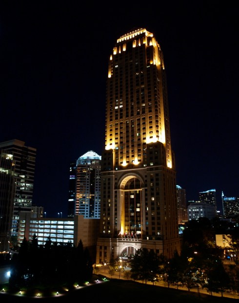
The original objective the evening this was taken was to get some sunset photos. Every one of the three dozen of those, however, was a little too this or way too that. This one, taken long after the sun disappeared, turned out to be the best of the batch.

Have you ever noticed how tall that building is?

Stat-urday: Slow growth, zero-vehicle households and the price of living somewhere less expensive

1 Sep

Population growth in the city and surrounding metro area slowed down dramatically in the second half of the past decade. While that statement might have the ring of a headline from Obvious Monthly, looking at specifics takes it from “Well, Duh” to “Whoa.”

ARC estimated that the 10-county Atlanta metro region’s population grew by 34,550 in the year between April 2010 and April 2011. That’s about 65 percent less than the yearly rate between between 1990 and 2000.

“Over the last three years, essentially since the recession began, the 10-county region has added approximately 91,000 people. To put this into perspective, during the fast-growing 1990s and the 2000 decade, the Atlanta region routinely added 100,000 new residents each year.”

The city of Atlanta, which still hasn’t recovered the more than 70,000 residents it lost between 1970 and 1980, had a net increase of only 697 residents between 2010 and 2011. While that number is still the subject of a dispute between the city and the Census Bureau, it falls well within the pattern of the last 40 years.

The report uses American Community Survey data from the country’s 100 largest metro areas to sketch a profile of the 10 percent of those areas’ households that don’t have a car.

“The United States added over 655,000 roadway lane miles since 1980, leading to the rapid decentralization of housing and jobs. Such decentralization leaves a zero-vehicle household’s most likely travel modes—transit, walking, and biking—at a structural disadvantage due to evergrowing distances between locations.”

Just seven of those 100 metro areas contain nearly half of all the zero-vehicle households studied. The New York area contained 28 percent of them, followed by Chicago, with about 5 percent. Los Angeles, Philadelphia, Boston, San Francisco and Washington, DC rounded out the top seven.  Atlanta was around the middle of the pack, with a little more than one percent of the total.

 Among the study’s findings:

  1. Nearly 60 percent of zero-vehicle households in the country were classified as low-income and nearly 62 percent of them are in the primary cities of their metro areas.
  2. While households without cars tend to congregate in central cities, and transit agencies tend to concentrate their coverage in those areas, about 700,000 zero-vehicle households are in areas not served by transit. In the Atlanta area, 37,634 of the 119,638 households without a car also don’t have transit coverage.
  3. Zero-vehicle households are distibuted pretty evenly across ethnic groups. White households made up 36.4 percent of those without a car, Hispanic households 27.7 percent, and black households 25.3 percent.
  4. People living without a car in suburban areas of the South have less access to jobs than any other group.

With purchase prices for housing having slid a lot in the three years since this index was published, some of the figures are probably a little different now.  But it still illustrates the choice many workers have to make between expensive housing and an expensive commute.

The fact sheet for the Atlanta metro compares combined housing and transportation costs for areas within the city, just outside the city and a far north suburb:

Housing costs for residents of Canton, in Cherokee County, averaged about 26 percent of annual income, while those in Sandy Springs spent almost 36 percent. Around Lenox Square it was almost 40 percent. So, by living much farther outside the city, one might spend around 50 percent less on housing.

But “drive ’til you qualify” only works if you rarely leave home.

Workers living in the neighborhood around Lenox Square spent an average of 16.82 percent of their income on transportation, while workers in Canton spent more than twice as much – 29.12 percent. Workers in Sandy Springs spent 21.78 percent. The difference between the intown commuters and those in Cherokee County is glaring, but even more so taken with the fact that the median annual household income in Canton was $8,376 less than in the Lenox Square area.

The numbers also reflect the raging height of the housing bubble at the end of 2007. If CNT’s numbers are to be believed, the cost of owning a house in the Lenox Square area had spiked to an average of more than 73 percent of the area’s median income. In Cherokee County it was about 27 percent.

If you’re curious about the numbers for your neighborhood, there’s a detailed interactive map for Atlanta and 51 other metro areas at the CNT site.

%d bloggers like this: